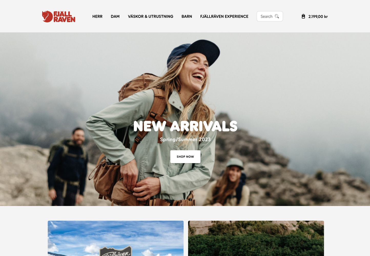
Product Listing Page
An audit was conducted on the Product Listing Page to find ways to improve the user's journey and uncover pain points that user's might feel while shopping for products. The objective was to discover low hanging usability issues that could be taken care of right away.
Changes
The biggest focus was to improve the filter menu - providing better visual and textual cues for color selection, creating a grid system for the size options, a slider for selecting price range. The biggest change in experience was in the mobile view. Where before the filter menu almost felt inconspicuous - now the menu is an overlay with prominent options for viewing results or closing the menu.
Desktop
Before
After
Mobile
Before
After
Checkout
I identified moments in the checkout journey where the user experience could be improved - this touched on many aspects: quantity updater, remove and subsequently undo remove, incorporating a progress bar, improving the shipping, billing and payment input fields, and much more.
Before
After
The order summary was improved to create clearer separation between items and other order information. Shipping cost was converted into a dynamic field that changed depending on the order value and related "Free shipping" ongoing promotion.
OTHER Changes
The company has numerous products and services under its belt and it is often important, especially those working in the field driving the business to get updates about the market conditions and behavior. The BI portal helps them to get into the details about these products down to the localized neighborhood to understand how the market is performing to make informed decisions.

Order Summary page allows users to edit quantity easily and receives warning when they're about to remove an item

New shipping details page with increased affordance for signing in

Order Summary now provides Out of Stock information, allows users to undo removed items
More TO COME
The design team is in the process of working alongside the development team to bring more tools to the company, all of whichi can help contribute by enabling decision-makers, salesforce and product managers.
Search
The search was one of the most poor experiences on the website. Despite this, users who searched converted more than users who didn't. This may be because they came here looking for a specific product. Regardless, we wanted to make it easier for these users to find what they're looking for.
Before


In the original design - the search is almost an afterthought despite site visits with search yielding 2x more conversions than otherwise. The search overlay is also very faded and visually lackluster and doesn't provide a lot of affordances to the user. The search overlay contained no suggestions for autocomplete, recent searches, or any other helpful cues. Often search for a common keyword yielded results in alphabetical order which was not useful for the user.
After


The new design increases the affordance of the search button - turning it into an input field, a clear cue for typing information. More work on this is underway to define how we can improve the overall navigation. Also, in this new experience, the search field expands to allow users to focus only on their search action - while the system also provides helpful cues such as recent searches, popular products and also relevant categories according to the search term.